Get Help

What is Data Visualization?
Data visualization, often abbreviated Data Viz, is the graphical representation of data.
Data visualization is typically employed to either explore data or to explain data.
When it is used to explore data, the creator is trying to explore and understand patterns in their own research data. When it is used to explain data, the creator already understands the patterns in the data and they are creating the visualization to explain those patterns to others.
Because they are for an outside audience, explanatory data visualizations tend to be more sophisticated and planned while exploratory data visualizations are often created quickly and multiple version are made in rapid succession as the creator digs through their own data and tries to make sense of the patterns.
Why Use Data Visualization?
Data Visualization allows us to more easily think about data. While data can be analyzed without a visual representation, working with data in other forms such as a table, can be laborious and even descriptive statistics don't always reveal important aspects of data. Take for example, the famous example of Anscombe's quartet, a group of 4 data sets that have nearly identical simple descriptive statistics.
Here’s what the four data sets look like as table:
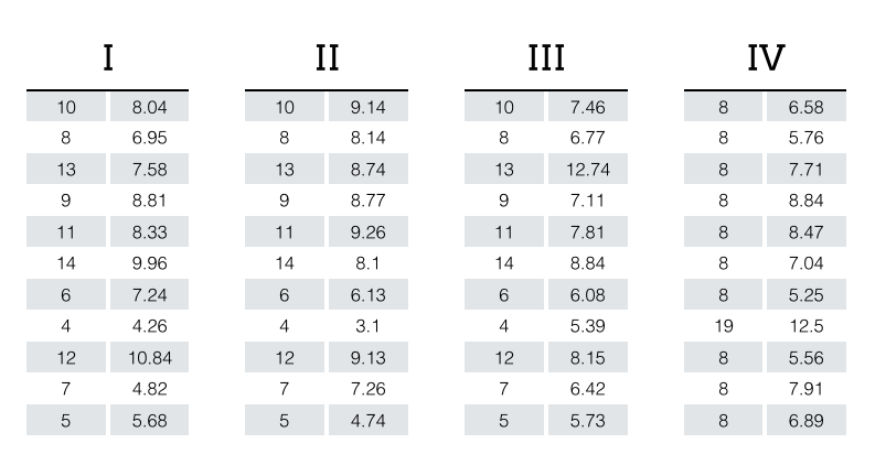
Certainly, analysis is possible, but it's laborious and no immediate patterns jump out. However, this is what the same data sets look like as charts:

Immediately we are able to see that each data set has a very different distribution and is unique from the other data sets in the quartet.
Image of Anscombe's Quartet plot published under the terms of "Creative Commons Attribution-Share Alike", source: https://commons.wikimedia.org/wiki/File:Anscombe%27s_quartet_3.svg
Anscombe's table source: https://multithreaded.stitchfix.com/assets/images/blog/anscombes_quartet_table.png
Types of Visual Representations
Data Visualizations - Data visualizations emphasize the data more than the design. Data visualizations focus on objectively conveying the data to the viewer for interpretation and analysis. Most charts, maps, and plots are considered data visualizations. Data visualizations are usually generated by a computer.
Infographics - Infographics tend to focus on one or two key points extracted from the data, not all of the data. Infographics are custom drawn/designed and are more aesthetically pleasing than other visualizations. Infographics can also convey abstract ideas or be used to entertain. Infographics usually target specific audiences. Infographics can contain data visualizations (charts, maps, diagrams).
Data Art - Data Art is more about presenting data (or an idea) in a visually appealing way than about presenting the data in a way that promotes interpretive accuracy. Data Art tries to evoke an emotion or mood. Data Art is often meant for exhibition purproses.